As most of you know, Red Gate acquired Cerebrata – arguably the leading developer of tools for Windows Azure developers – in September 2011. This made sense to us for a few reasons: firstly, we’ve been using Windows Azure internally for a number of projects, and we have experienced how great it is; moreover, we were having increasing numbers of conversations with developers and IT pros from around the world that were using Windows Azure and wanted better tooling. To be honest, the acquisition felt like a no-brainer.
It’s now been 18 months since the acquisition and we thought it was time we shared what we’ve been working on and our plans for the future. It’s a pretty exciting period for us, as we have two new tools to announce. The first is our new flagship product, Azure Management Studio, a pro tool for people who are serious about Windows Azure – it’s also a free upgrade to all existing users of both Cloud Storage Studio and Azure Diagnostics Manager. And secondly, we are very pleased to introduce our first free Windows Azure tool, Azure Explorer, a Windows Azure storage tool for people who are just getting started with Windows Azure and want the best Blob management tool available.
 |
Azure Management Studio |
 |
Azure Explorer |
The team moves fast. Very fast!
We got lucky with Cerebrata, not only in that the founder, Gaurav Mantri, wanted to be involved throughout the handover process, but also because the team was keen to work with us. It was immediately obvious why they had been so successful. They knew Windows Azure inside and out – so well that it became a bit of a running joke. Whenever we Googled a Windows Azure problem or question, more often than not, we’d stumble on an MSDN or Stackoverflow answer by Gaurav. The next lesson from the team to take on board was just how quickly they blasted out new functionality. Microsoft would introduce something to their Windows Azure APIs, and within days, the Cerebrata team would have it in their tools. A week or two later they’d have feedback from the community and plans on how to take the new feature forward. Their pace is one of the things we admired most about their team, and we’re dedicated to maintaining that speed as we move forward.
Great functionality. Not so great usability.
The Cerebrata tools are feature-rich, which was one key differentiator that made them so appealing to us. There are free tools which cover some Windows Azure functionality, but as soon as you have applications in production, you typically require more functionality and better performance. We saw that in Cerebrata’s tools and believe it to be a major reason their tools are used by thousands of developers around the world.
Wely Lau wrote a great article comparing the different Windows Azure storage tools, and whilst he acknowledged Cloud Storage Studio as the pro-choice for developers who were serious about Windows Azure, he wasn’t particularly positive about the interface and usability. That really resonated with us and was something we were keen to fix.
To better understand the problem, and to understand why people use our tools, we spent two months usability testing the Cerebrata tools. We’ve shared some of these problems below to give you an idea of how the products are evolving.
Far too many tabs
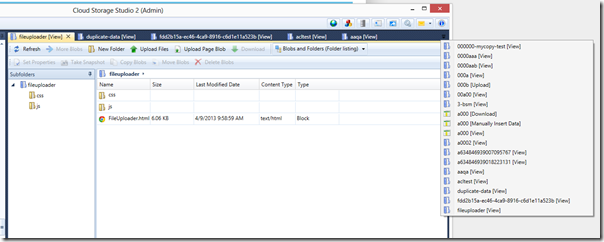
Our tool uses a tabbed pane interface, much like Visual Studio. However, in Cloud Storage Studio, we soon realized it was far too easy to open too many tabs (bit like SSMS, at least if you use it like me!). Most serious Windows Azure applications make use of Blobs, Tables, and Queues, and consequently you end up with twenty open tabs in no time. This problem was exacerbated by the fact that to begin with, you have a tab for viewing blobs, a tab for uploading blobs, and a tab for downloading blobs. Same goes for Tables and Queues. It was a nightmare, and meant your tasks and transfers, some of which were long running, would be split among an unmanageable number of tabs.
Too many tabs in Cloud Storage Studio
We decided to remove as many tabs as possible and group related and connected functionality into a sensible set of tabs. We also overhauled the interface encircling transfers and tasks, allowing users to better do things like observe activity, pause transfers, and reorganize transfers – basically all the things you’d expect to see in a modern file transfer tool.
New task panel in Azure Management Studio
We also wanted to make it really easy to support those tasks that are difficult to perform in the Windows Azure Management Portal; for example, set the metadata on a thousand blobs or quickly drag and drop files between your local machine and your many blob containers. These things are all now intuitively simple to do in Azure Management Studio and Azure Explorer.
It was confusing in places
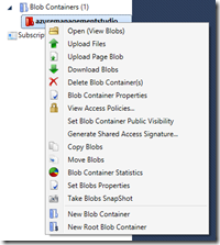
After watching dozens of people struggle to navigate our menus and fail to discover useful functionality, we decided to overhaul all the menus and toolbars in our application. As simple as it sounds, it makes a big difference to the tool. I remember demoing one of our tools soon after the acquisition and struggling to find a bit of functionality that I knew we supported—pretty embarrassing!
 |
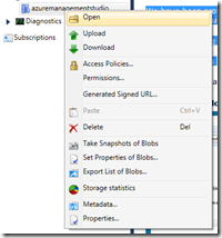 |
| Terrible menu | Better menu |
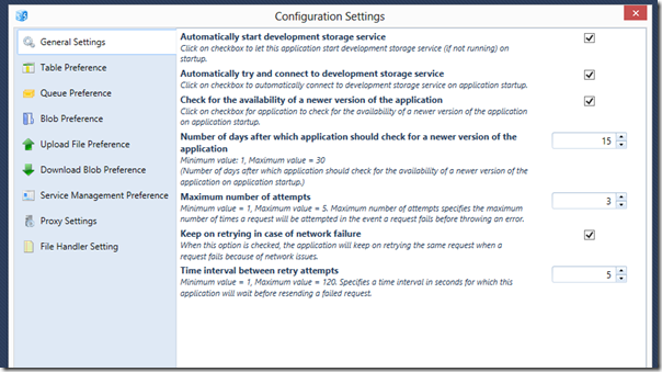
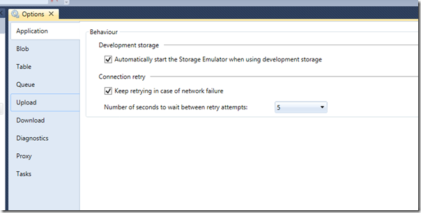
We also noticed that a lot the dialogs were inconsistent and not very intuitive. For example, you could easily delete all your Blob Containers without much warning: not good when you’re working with valuable data! To this end, we reviewed all the key strings and dialogs, as well as the application options – our tool supports permissions, block size settings, all sorts of things that were being overlooked as they were difficult to interpret.
Configuration settings dialog in Cloud Storage Studio
Redesigned options in Azure Management Studio
It didn’t quite behave like you would expect
Some functionality behaved exactly as expected, following best practices and established norms, but a lot of functionality went off-piste. For example, most users expected the file manipulation aspect of our tool to behave exactly like Windows Explorer, so we spent some time standardizing functionality. Another example was that you could easily export your Windows Azure connection settings, but it wasn’t clear how to import them—so we added Import Connection Settings to the File Menu. These are trivial changes in and of themselves, but as a whole they make the tool much easier to use.
We also added some new functionality
In addition to improving the usability, we couldn’t resist adding some new functionality. Luckily, we have an amazing bunch of users who regularly send us detailed feedback, which made prioritizing some changes easy.
Blob search and bookmarks
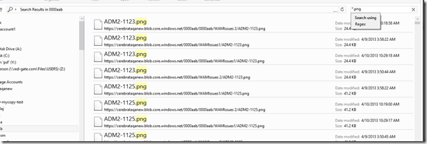
Eli wanted to be able to search across his blob storage and bookmark common locations – doubly valuable when you have thousands of blob containers. You can now easily search across your blobs (and with Regular Expressions) and you can also bookmark common locations, allowing you to go straight to your frequently accessed locations.
Blob search in Azure Explorer
Table data filtering
Mike was fed up downloading table data and filtering it with other tools. He suggested we add fast-find type functionality on returned table entities, making it easy to search across table data. We stuck with what most common browsers do, adding fast find to CTRL-F.
Table data filtering in Azure Management Studio
Project and user profiles
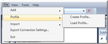
We also completely reworked the Admin and Client modes of our application. Most people don’t know this, but in Cloud Storage Studio—and now in Azure Management Studio—you can do things like restrict permissions to your Windows Azure assets, control access to blobs, and allow only certain users to update tables. This is useful in teams, or for consultants or contractors, who want to give restricted access to certain people or simply want to prevent accidental deletes. However, it was quite difficult to use and a large number of people found themselves stuck in Client Mode, with limited access to their own Windows Azure accounts. We now have Profiles, which allow you to quickly create project- or user-specific views into your Windows Azure applications; for example, you can now group all Production-related items into a single Profile.
Profile menu in Azure Management Studio
We’ve added a bunch of other stuff, too, which we’ve been working on via our private and public beta programs. For that, we’d like to thank the hundreds of users who tried Azure Management Studio whilst it was in private beta, taking the time to share their feedback. We’ve been blown away!
Plans for the future
We’re still working with the Cerebrata engineering team and have been prototyping some new functionality for our first few point releases. Firstly, we’ll be adding support for Virtual machines in Azure Management Studio 1.1, letting you control and manage your IaaS images, disks and endpoints without visiting the Portal. Next we’ll be adding rich support for the Service Bus, letting developers monitor and debug the Service Bus Queues. We’re aiming to ship a new release each month, and would encourage all of our existing users to upgrade to Azure Management Studio today.
And after that? Our goal is to continue evolving as close to the pace of the original Cerebrata team as we can manage. And as always, we’ll be listening to our users, via community events, usability testing, and direct communications—and speaking of which, if you’re interested in learning more about Azure, I’d recommend signing up for Microsoft’s global Windows Azure event, which is taking place later this month. We’ll be sponsoring it and providing free licenses for AMS. If you have any thoughts, just drop me an email (ljefferson@cerebrata.com). We’re very excited about what’s in the pipeline, and we’re looking forward to sharing it with you in future blog posts.

