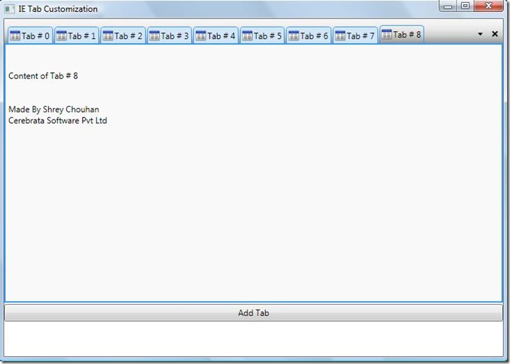
In this blog I m going to explain how to customize the WPF Tab Control like an IE tab control.
We mostly face this problem in WPF tab control when we are trying to open more tab items dynamically, it goes arrange in vertical form and it goes down and down. This is not good looking.
Few days ago I also face this problem when we were giving a new look to our new product Cloud Storage Studio, which is a desktop application for azure storage.
I am attaching a sample demo below this blog to your help for better understand.
First we create a Grid in the Window file e.g.
<Grid>
        <Grid.RowDefinitions>
            <RowDefinition Height="*"/>
            <RowDefinition Height="2"/>
            <RowDefinition Height="25"/>
            <RowDefinition Height="25"/>
            <RowDefinition Height="25"/>
        </Grid.RowDefinitions>
        <TabControl HorizontalAlignment="Stretch" Width="Auto"
                    x:Name="TabControl" Grid.Row="0"
                    IsSynchronizedWithCurrentItem="True"
                     VerticalAlignment="Stretch"
                    Height="Auto" Style="{DynamicResource TabControlStyle1}">
        </TabControl>
        <Button x:Name="Add" Grid.Row="2" Content="Add Tab" Click="Add_Click"/>
</Grid>
I use “Add” button to add Tab Items dynamically in the tab control.
Now we will discuss about the customization of tab control style. I am using TabContorlStyle1. Now you have to take a help of expression studio at this time. Open your project in expression blend, edit the style of tab control and save the project you will see a complete code of tab control style in xaml file.
Now you have to make some little changes in it to make like an Internet Explorer 7.0 in style as well in working. I add scroll viewer in the place of Tab Items in TabControlStyle1, so that I can add more tab items in horizontal orientation.
Now we need three things for customization:
- Content Presenter where our tab item resides.
- A Combo box from where we can see all active tabs
- A Close button from which we can close the selected tab.
Now I add these things in the Control Template of scroll viewer like this:
<ScrollContentPresenter Grid.Column="1" Content="{TemplateBinding ScrollViewer.Content}"/>

<ComboBox Height="20" x:Name="CBOpenTabs" Grid.Column="3"
          SelectionChanged="CBOpenTabs_SelectionChanged"
          DropDownOpened="CBOpenTabs_DropDownOpened"
                ItemTemplate="{DynamicResource cbItemsStyle}"
                Style="{DynamicResource CustomComboBoxStyle}">
     <ComboBox.Resources>
       <DataTemplate x:Key="cbItemsStyle">
               <Grid Margin="2,2,2,2">
<Grid.ColumnDefinitions>
<ColumnDefinition Width="Auto"/>
<ColumnDefinition Width="*"/>
 </Grid.ColumnDefinitions>
<Image VerticalAlignment="Center" Grid.Column="0" Source="{Binding HeaderImage}"
    Margin="0,0,2,0" Height="15" Width="15"/>
<TextBlock VerticalAlignment="Center" Grid.Column="1" Text="{Binding HeaderText}"/>
              </Grid>
      </DataTemplate>
  </ComboBox.Resources>
</ComboBox>

<Button Height="20" x:Name="CloseTab" Grid.Column="5"
        Style="{DynamicResource CloseButtonStyle1}"
        Click="CloseTab_Click" />
Note: Here I used style in every control so don’t be confused you will get this style in demo project. Now in combo box I write two events .cs file and in close button I write click event. To access this control in .cs file I write loaded event on grid so that at run time I get the instance of these controls. And I easily close and select the tab items from combo box. Hope this blog will help you to make your application good looking. Sample Demo project….
CustomTabProject Thanks Shrey Chouhan

